Customizing the Widget
The gauge you see is the WBP_GaugeSkillCheck widget, built on the C++ base class UI_RadialCheckWidget. To restyle the dial, duplicate that widget (or build a new one that reparents to the base class) and edit the visuals. The component only needs the bound widgets below to exist; everything else is yours to design.
Required widget bindings
Section titled “Required widget bindings”The base class binds two child widgets by name, so your widget must contain them with these exact names:
| Widget | Type | Purpose |
|---|---|---|
Image_Gauge | Image | The sweeping indicator. It should point up at rest; the C++ handles the rotation. Its pivot comes from Gauge Pivot. |
SizeBox_Container | Size Box | Wraps the gauge content. It must be a child of the root Canvas Panel; its position is moved in Random Position mode. |
How values reach the widget
Section titled “How values reach the widget”Before each check, the component pushes the live values into the widget through Blueprint-callable setters (all normalized 0 to 1):
| Setter | Meaning |
|---|---|
Set Check Angle | Current indicator position. Drives the Image_Gauge rotation for you. |
Set Good Zone Size | Width of the good zone. |
Set Great Zone Size | Width of the great zone. |
Set Zone Start Angle | Where the good zone begins on the dial. |
Set Great Zone Start Angle | Where the great zone begins (inside the good zone). |
Once the zone values are set, the widget fires On Zone Values Updated, a Blueprint event you override in your widget. Use it to redraw the zones, for example by feeding the good and great sizes and start angles into the dial’s radial material so the colored arcs match the actual scoring ranges.
Recoloring the zones
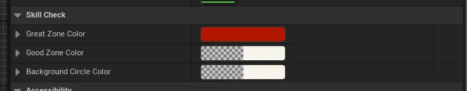
Section titled “Recoloring the zones”The shipped WBP_GaugeSkillCheck exposes three colors you can set right on the
widget. Select it and look under the Skill Check category in its Details:
| Property | What it tints |
|---|---|
Great Zone Color | The narrow perfect-hit arc. |
Good Zone Color | The wider success arc. |
Background Circle Color | The dial ring behind the zones. |
Under the hood the zones are drawn by a dynamic radial material over a static background circle. If you build your own dial, drive that material from On Zone Values Updated using the normalized sizes and start angles, so what the player sees lines up exactly with what the component scores.
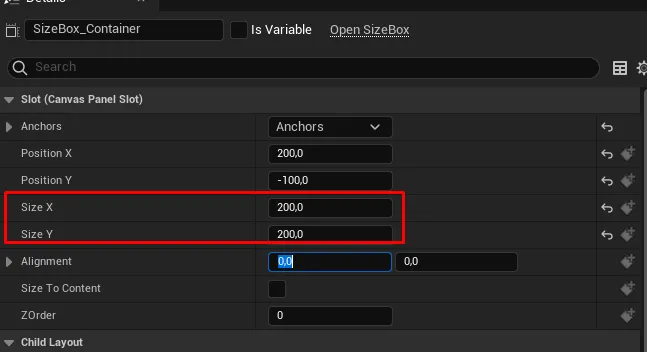
Sizing the gauge
Section titled “Sizing the gauge”The on-screen size comes from the SizeBox_Container slot. Select it and set
Size X and Size Y in its Canvas Panel slot (the shipped widget uses
200 x 200).
The gauge pivot
Section titled “The gauge pivot”Gauge Pivot on the widget (default (0.5, 0.9)) sets the rotation pivot of
Image_Gauge: X runs 0 (left) to 1 (right), Y runs 0 (top) to 1 (bottom).
The default pivots near the bottom center, so the indicator swings like a clock
hand around the hub of the dial.
Random placement
Section titled “Random placement”In Random Position mode the component repositions SizeBox_Container by
setting its Canvas slot anchors, so the box must sit directly inside a Canvas
Panel (the shipped layout already does). Tune how far the gauge can stray from
the edges with Random Position Margins in
Gauge Settings.